ONEPASS
Q2 2026
Redesigning access and credential management for a global financial institution
93% self-service completion for the redesigned quick actions in a 12,000-employee pilot's first month

Confidential work, shown responsibly
To respect confidentiality, all screens shown are representative recreations with fictional data. The shipped designs, internal metrics, and research artifacts remain proprietary.
What is OnePass?
OnePass is one global financial institution's answer: a single hub for the full life of a workforce credential — getting access, managing it, and recovering it when it breaks — designed around a simple observation that took real evidence to earn: people don't visit a credential portal to browse. They visit because they're stuck, or because they want to know they won't be soon.
The Problem
Every locked out employee is a stopped employee
A locked account at a global bank isn't an inconvenience. It's a trader who can't trade, an analyst who can't open the model, a new hire spending their first morning on hold. Multiply that by a workforce of hundreds of thousands — each person carrying passwords, tokens, PINs, security questions, and registered devices, every one of them capable of expiring, locking, or failing at exactly the wrong moment — and credential management stops being an IT utility. It becomes infrastructure for whether work happens today.

Research
What the data told us
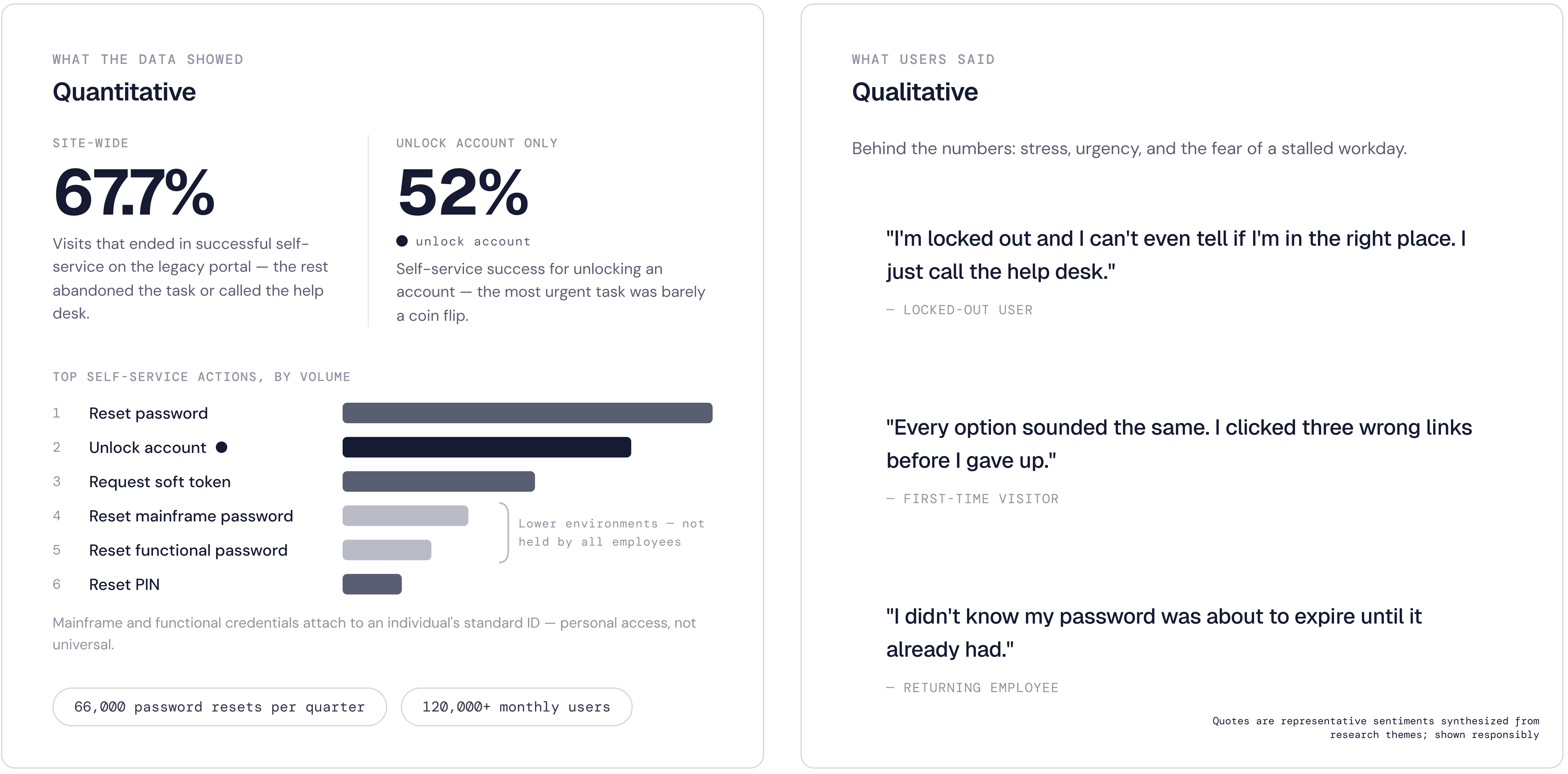
The analytics told me what users came for: a handful of urgent moments — unlocking an account, resetting a password or PIN, requesting a token. They also told me users were failing. Site-wide, only 67.7% of visits ended in successful self-service; the rest ended in abandonment or a help desk call. The average hid the worst of it. On the most urgent task — unlocking a locked account — only 52% succeeded without help, because unlocking was the only task that required reaching another person. The problem wasn't how the portal looked. It was what the system required. The interviews said the same thing in human terms: users weren't just failing, they were failing scared.
The Decision
Fix the experience, not just the interface
The redesign was scoped as structural work from the start: rethink how OnePass was organized, not just how it looked. The open question was where to focus. Research answered it. The abandonment driver lived below the interface, in a recovery process that made locked-out users depend on someone else to help them get back in the system.
So I built the case, and my product owner and I brought it to engineering, not as a critique but as evidence. The scope grew on both ends: an interface redesigned for high-stress moments, and a system redesigned to recognize a user's account status and initiate identity verification automatically. No more waiting on another person.
The Solution
Calm on the surface, intelligence underneath
The interface was rebuilt around how people behave under stress: four plain-language quick actions where a locked-out user lands first, account status (are they locked out), password help (if your password expired or if your logged in but forget it), request soft token and reset pin. The information surfaced before any decision is asked of them, and every entry point named in the user's language instead of the system's.
Behind the surface, the firm opened additional authentication methods, giving users ways to prove their
identity and self-serve immediately — no more waiting on another person — while maintaining the institution's identity verification protocols. I've kept the system detail deliberately incomplete here: authentication architecture at a financial institution stays confidential, even anonymized. I'm happy to go deeper in conversation.
Designing for the heightened state

BEFORE

The starting point for the original OnePass application was a series of dropdown components with users trying to guess which system category to find the answers they need, while most of the screen sat unused.
AFTER

The redesign highlights four quick actions which matches why users visit the page, and immediately gives them account’s status.
The Redesign
The shipped design, with the principles marked where they landed. A locked-out user meets four plain-language actions instead of twenty menu options. The system speaks first — password expiration, token status — before asking anything of the user. And the page assembles itself around the individual: credentials you hold, devices you've registered, nothing you don't.
What the calm surface doesn't show is the point: behind it, the system now recognizes a locked account and opens verification paths that need no one's permission but your own.


The Internal OnePass locked state
The internal version of OnePass is also system aware, allowing the user to see the internal application, making it clear of the account status and guiding them through the self-service process.

Landing page in detail
The redesign in detail. Each decision follows the same rule: state before action, fewer choices at the point of stress.

Impact
EARLY SIGNAL • PILOT FIRST MONTH
Quick-action tasks completed through self-service, no help desk required
Employees in the pilot line of business — the first stage of a firm-wide rollout
Reflection
OnePass began as a visual refresh and became a systems project — because the research wouldn't support anything smaller. The lesson I carry forward: when users are failing, look below the surface before polishing it. The interface is only as calm as the system behind it.
What's next
Currently I'm designing in the privileged access space — reducing human dependencies in how the firm's most sensitive credentials are managed. Confidential for now; happy to discuss the approach in conversation.