SECURITY & PRIVACY CENTER
2024
The tools worked. The experience didn't.
65% increase in engagement · 288% growth in card lock usage · 41% reduction in bounce rate
The Problem
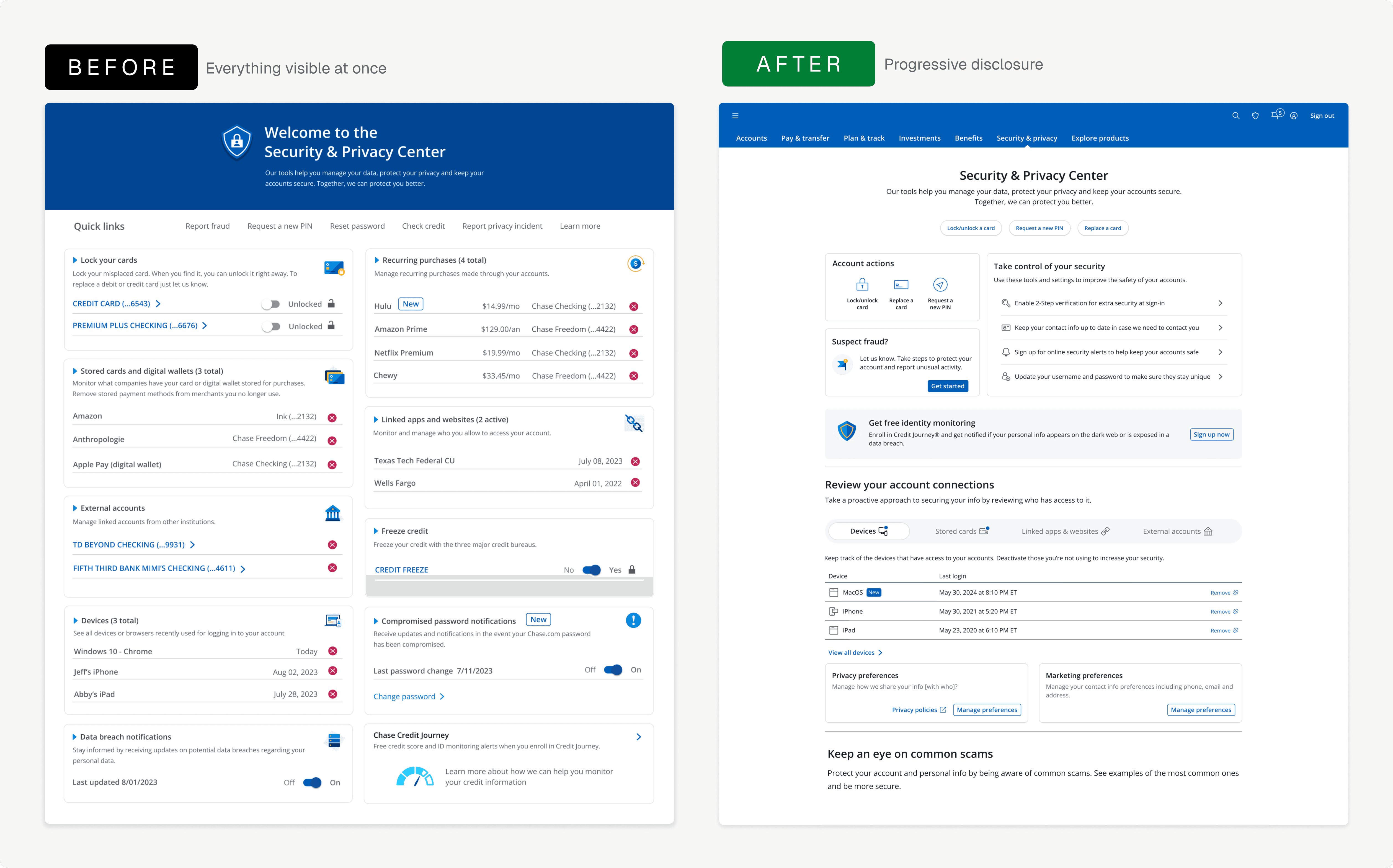
We gave users everything, but to them, it felt like surveillance.
Research was clear: customers wanted more visibility and more control over their data. So we built exactly that — every device, every subscription, every third-party connection, every privacy setting, all surfaced at once. Usability testing told us we'd gotten it wrong. Users didn't feel empowered by seeing everything. They felt exposed. The interface meant to give them control was reading as a wall of accusations: red Xs, dense lists, punitive language. We had confused visibility with control.
Punitive iconography
Red ✕ buttons next to every subscription, device, and linked account made managing data feel like damage control, not self-service.
Privacy buried, not featured
Critical controls like card lock and fraud reporting were treated as small text links in a header bar instead of prominent quick actions.
Research
What customers told us about control
The question wasn't whether customers cared about privacy — they cared intensely. The question was what privacy meant to them, how they wanted to exercise it, and why the tools already built weren't making them feel safer. Alongside two dedicated researchers, I ran structured user interviews, a feature-priority survey, and competitive benchmarking against the four biggest US banks. What we heard — and what usability testing later told us — reshaped every decision that followed.
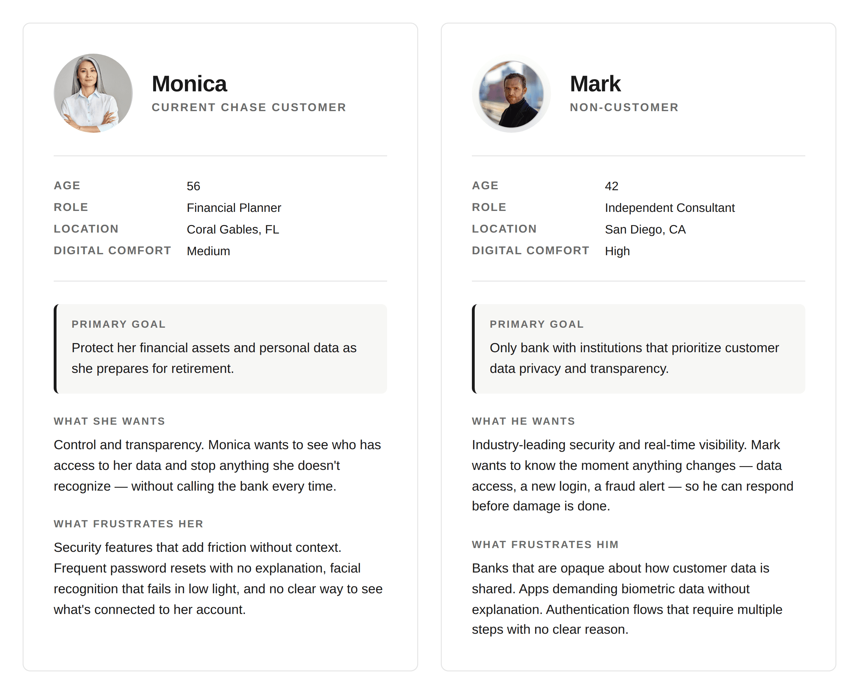
Two users, one shared expectation
Mark and Monica came from different worlds. They shared one expectation: give me control without making me work for it.
The bank wasn't behind on features. It was behind on clarity.
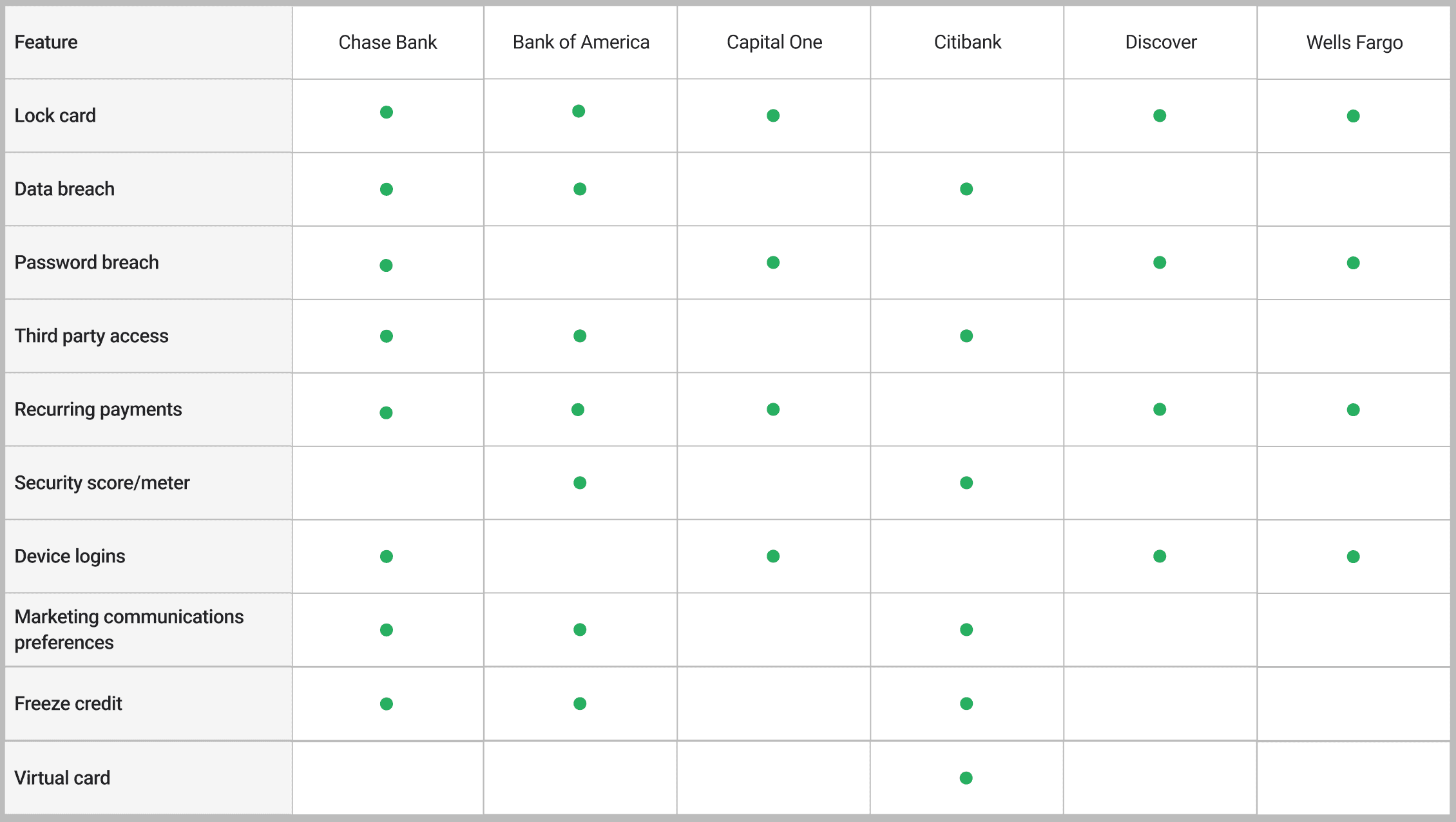
The bank had 8 of 10 privacy and security features measured across major US institutions — more than anyone. The redesign wasn't about adding capability. It was about making what already existed findable.
Features weren't the problem. Findability was.
We built exactly what research said users wanted — every device, every subscription, every connection, every setting, all visible at once. Usability testing told us we'd built the wrong thing. Users didn't feel empowered by seeing everything. They felt surveilled. The insight wasn't in the research — it was in recognizing the research had pointed us in the wrong direction.
Competitive analysis
"Control should feel like a choice, not surveillance."
— Participant in usability testing
Design Goals
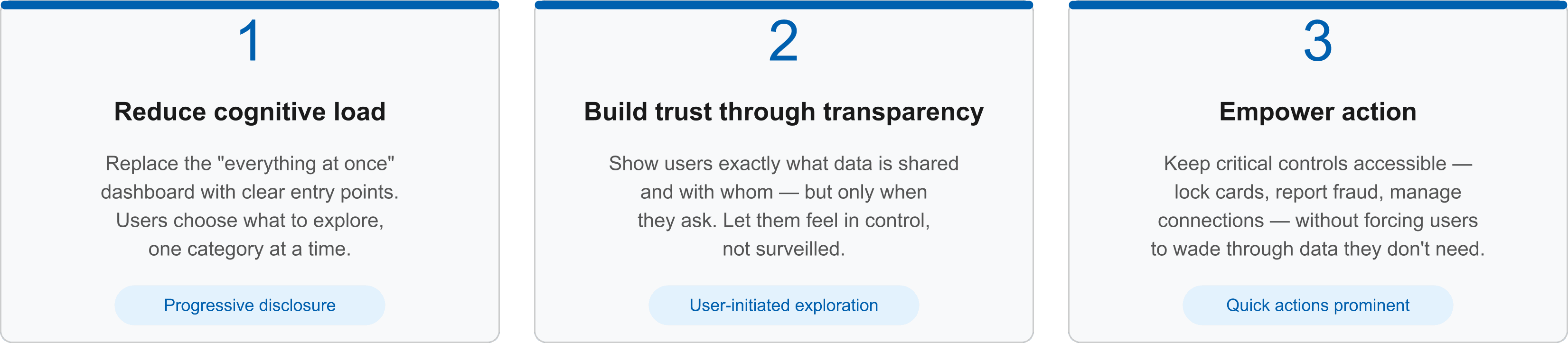
Three goals, one principle
Translating 'control as a choice' into design meant three specific goals.
The Solution
Control without confrontation
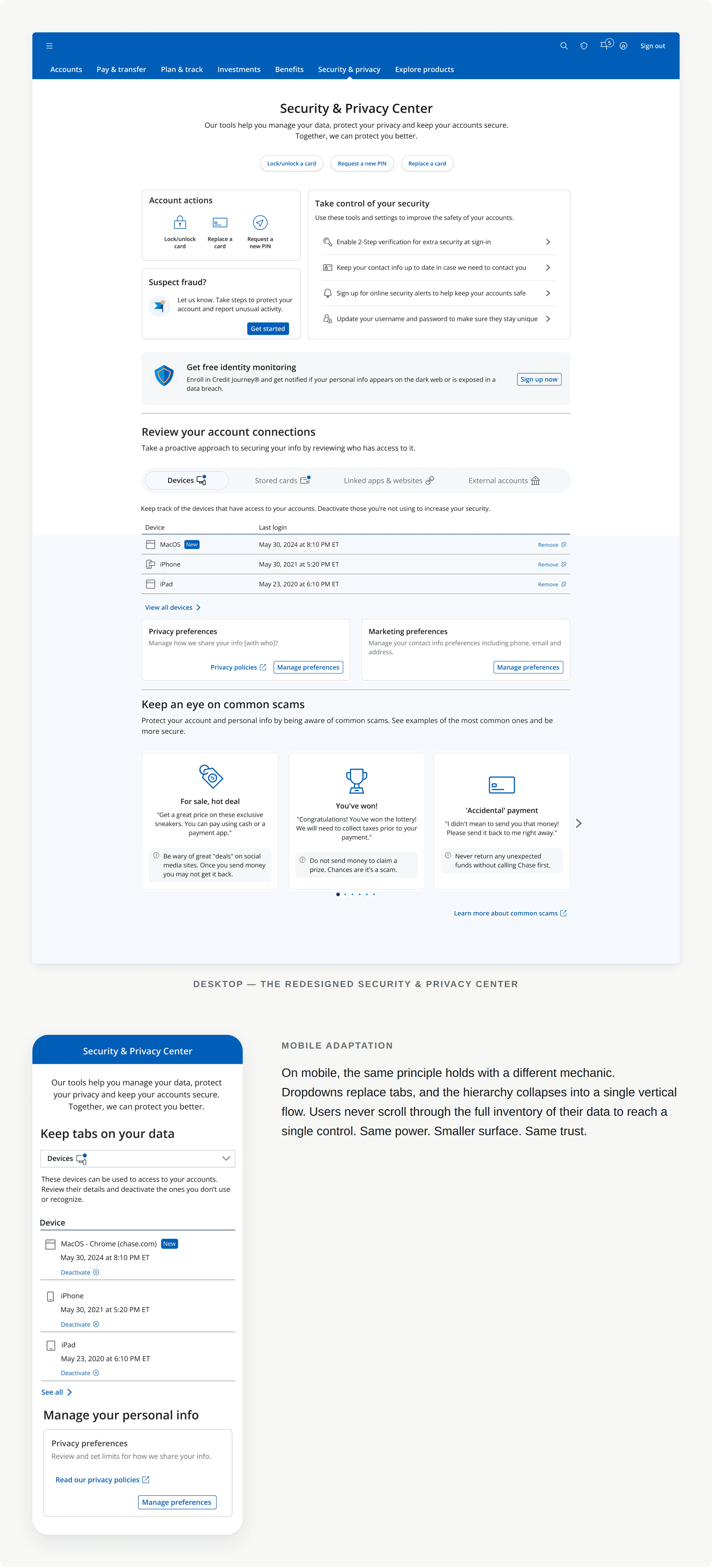
I explored two directions: keep every control visible at once — the approach the team had already built — or progressively disclose information as users asked for it. The first had already failed usability testing. Users didn't read it as empowerment; they read it as surveillance. The second gave them the same power, but let them choose how deep to go. I chose progressive disclosure.

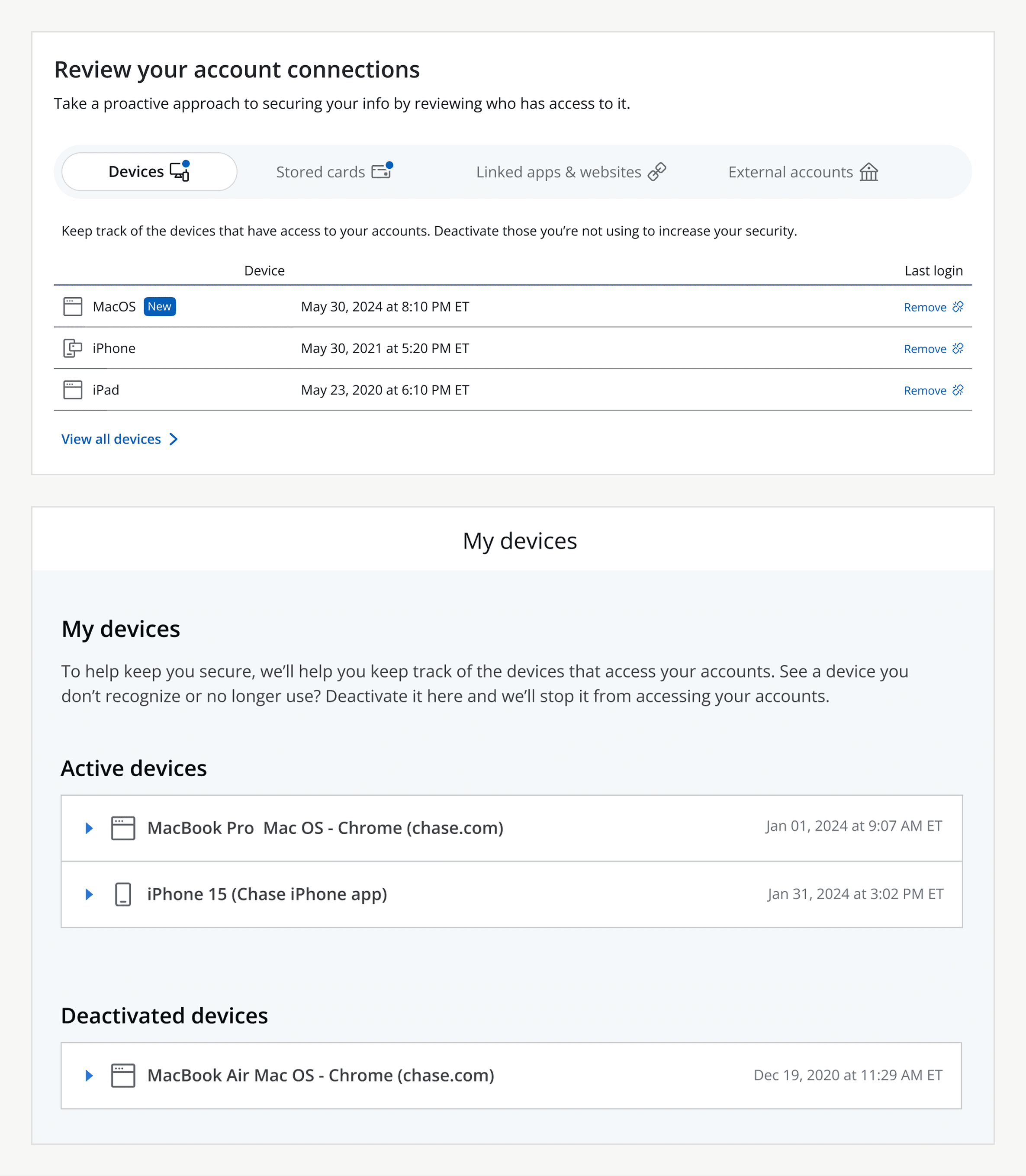
Anatomy of a tab group
The Devices tab shows progressive disclosure at the component level. The tab bar scopes context — one category at a time. Secondary metadata stays collapsed behind expandable rows. Quick actions sit one tap away. Empty states teach instead of confuse: when no deactivated devices exist, the tab doesn't go blank — it explains what would appear there and why.
Built accessible from day one
WCAG 2.1 AA was non-negotiable. Every tab group, expandable row, and empty state was specified with landmarks, heading hierarchy, tab order, and screen reader behavior from the first mockup. Accessibility wasn't retrofitted — it was built into the design system on day one.
The Redesigned Experience
From overwhelming to empowering
Business Impact
Proof in the numbers
Reframing control as invitation moved every metric. The Security & Privacy Center saw a 65% lift in overall engagement. Card lock usage — the metric that had been stuck flat for years — grew 288%. Bounce rate on the homepage fell by 41%. The redesign didn't give customers more tools. It gave them the ones they already had, in a way they could finally use.
Reflection
What I learned
In any domain where user trust is fragile, restraint is itself a design principle. Showing users less — and letting them choose what to see — communicated more confidence than showing them everything ever could.
What's next
I'm now applying the same principle — control without cognitive overload — to Chase's Identity and Access Management systems. The user changed. The premise didn't: control is only as valuable as its clarity.