Atlas Platform
2025
Unifying six fragmented data products into one self-service ecosystem
97% increased engagement • 43% reduced tickets • $2.4M operational savings
The Problem
Small teams, big data confusion
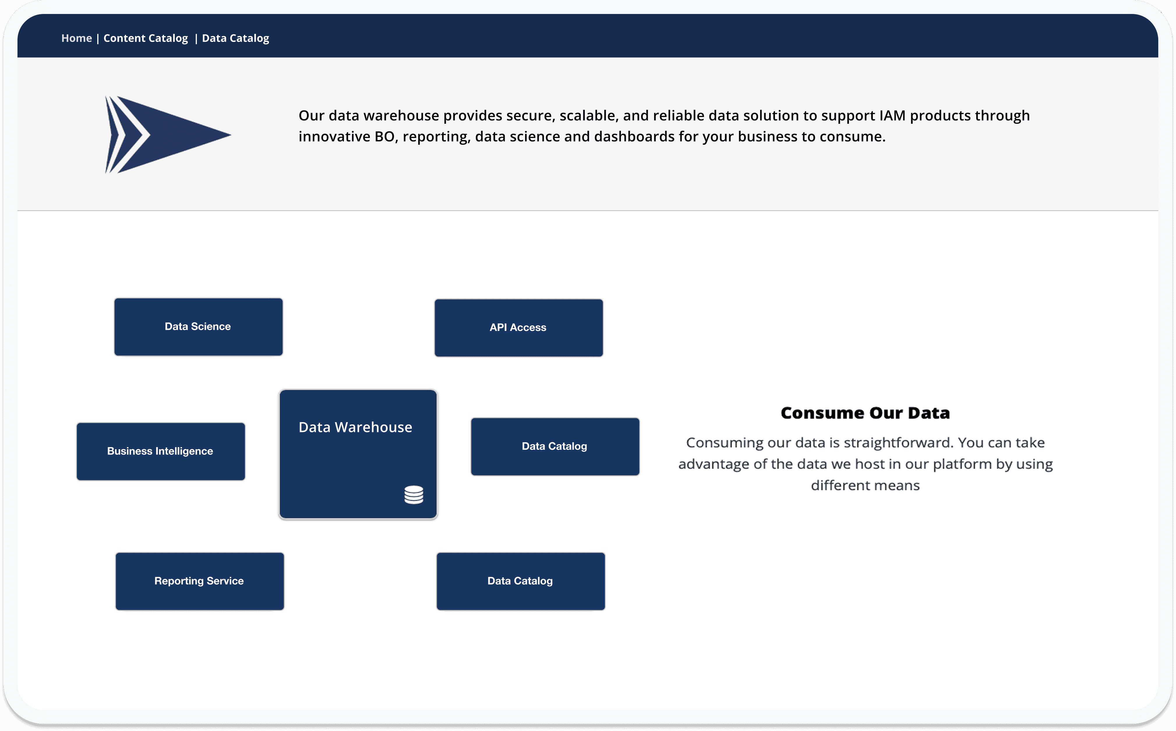
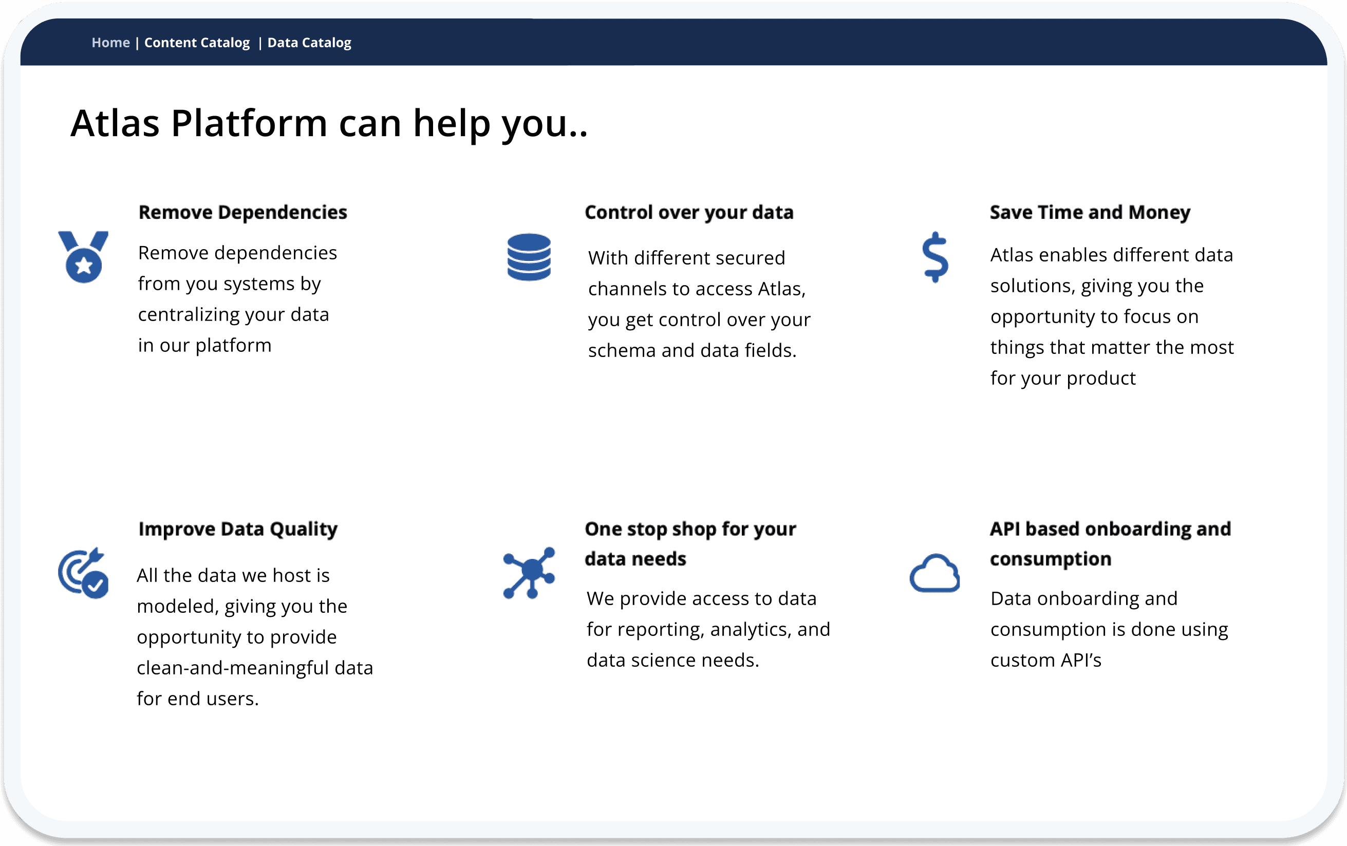
Analysts didn't know where to start. Six products, dozens of outdated documentation pages, and no clear guidance on which tool did what. They'd search, guess, ask a colleague, submit a ticket — and often still end up in the wrong place. The time lost wasn't just inefficiency; it eroded trust in the platform itself.
Before Atlas redesign
Research
What our analysts told us
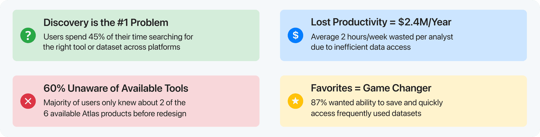
Four findings that reshaped the design
Alongside a dedicated UX researcher, I ran extensive 1:1 interviews, usability sessions, and a hybrid card sort — then layered in months of usage analytics. Four insights emerged that would define every design decision that followed.
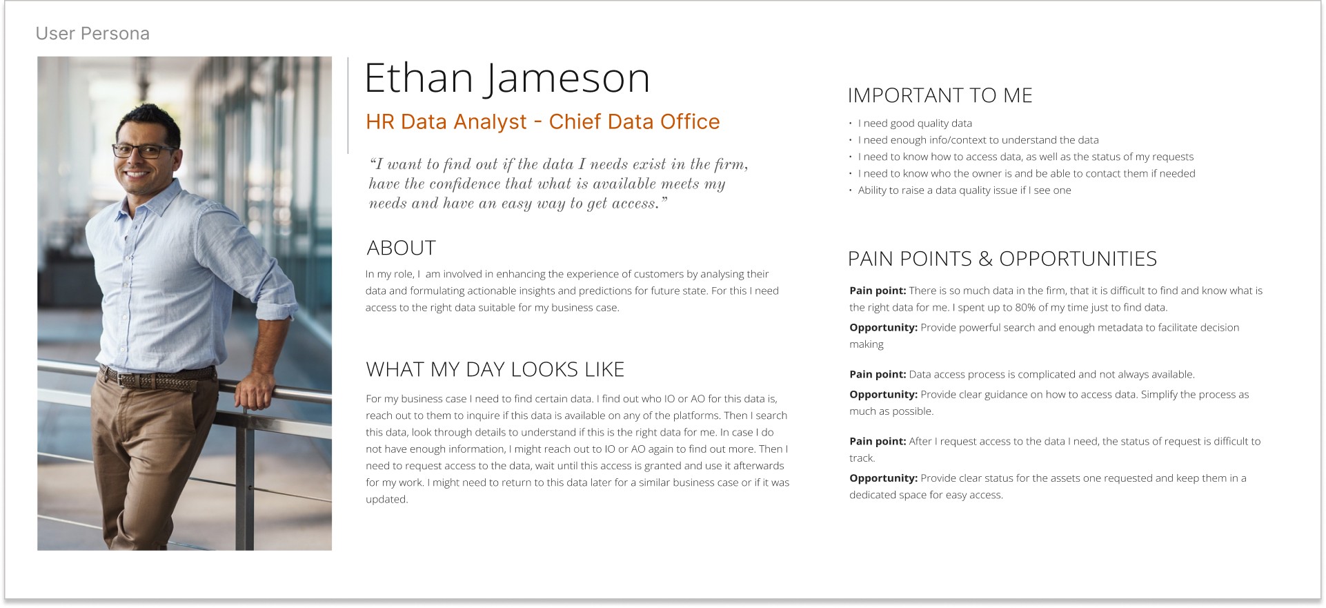
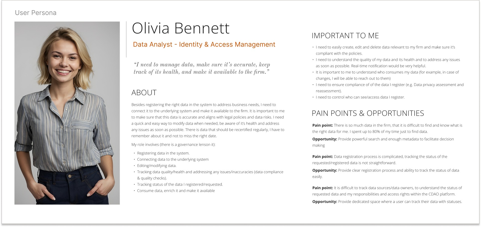
Two users, one shared frustration
The research revealed distinct user groups — people searching for data to do their jobs, and people responsible for managing it. Despite different roles, they shared the same core pain: finding the right data.
Mapping the pain
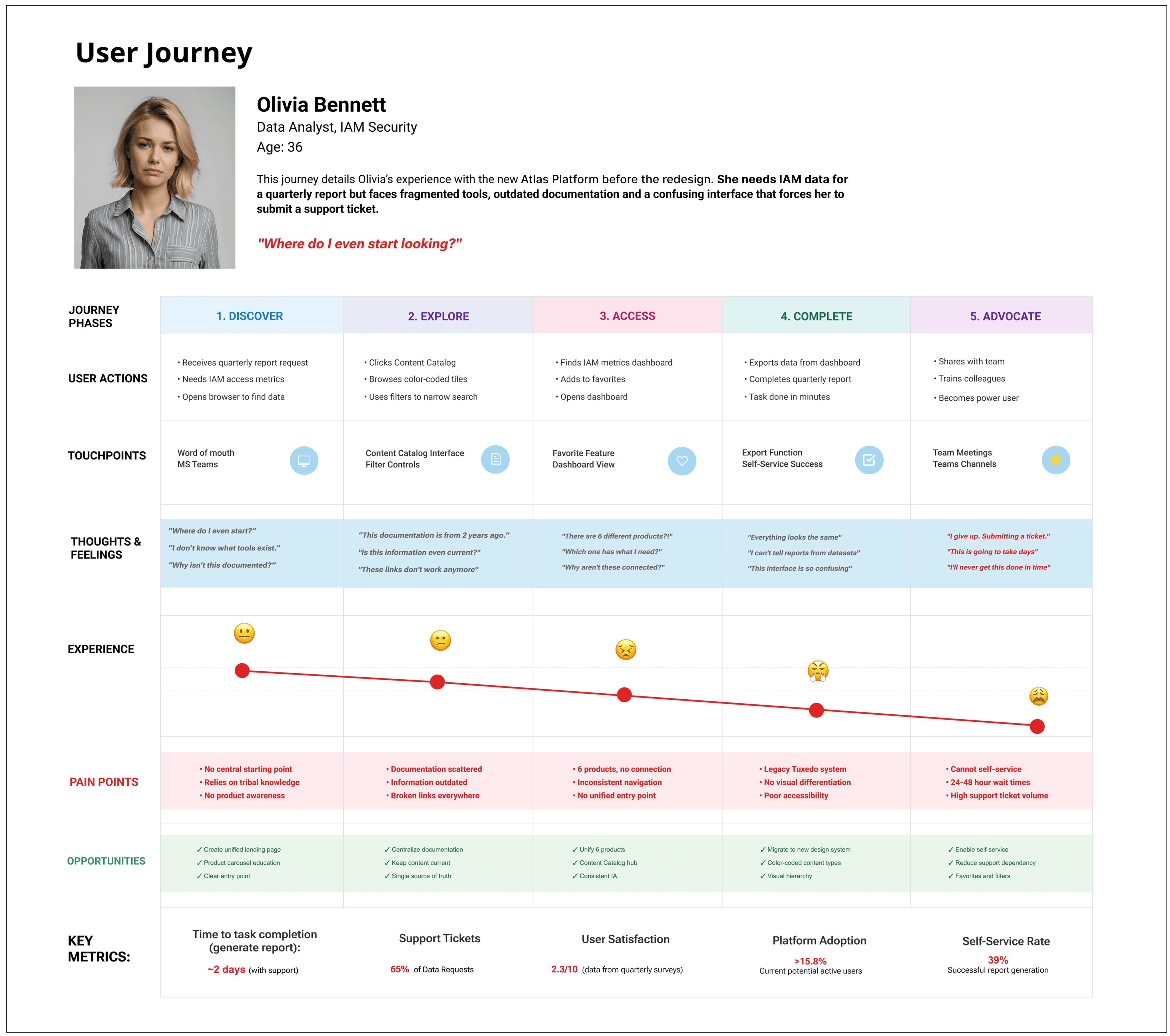
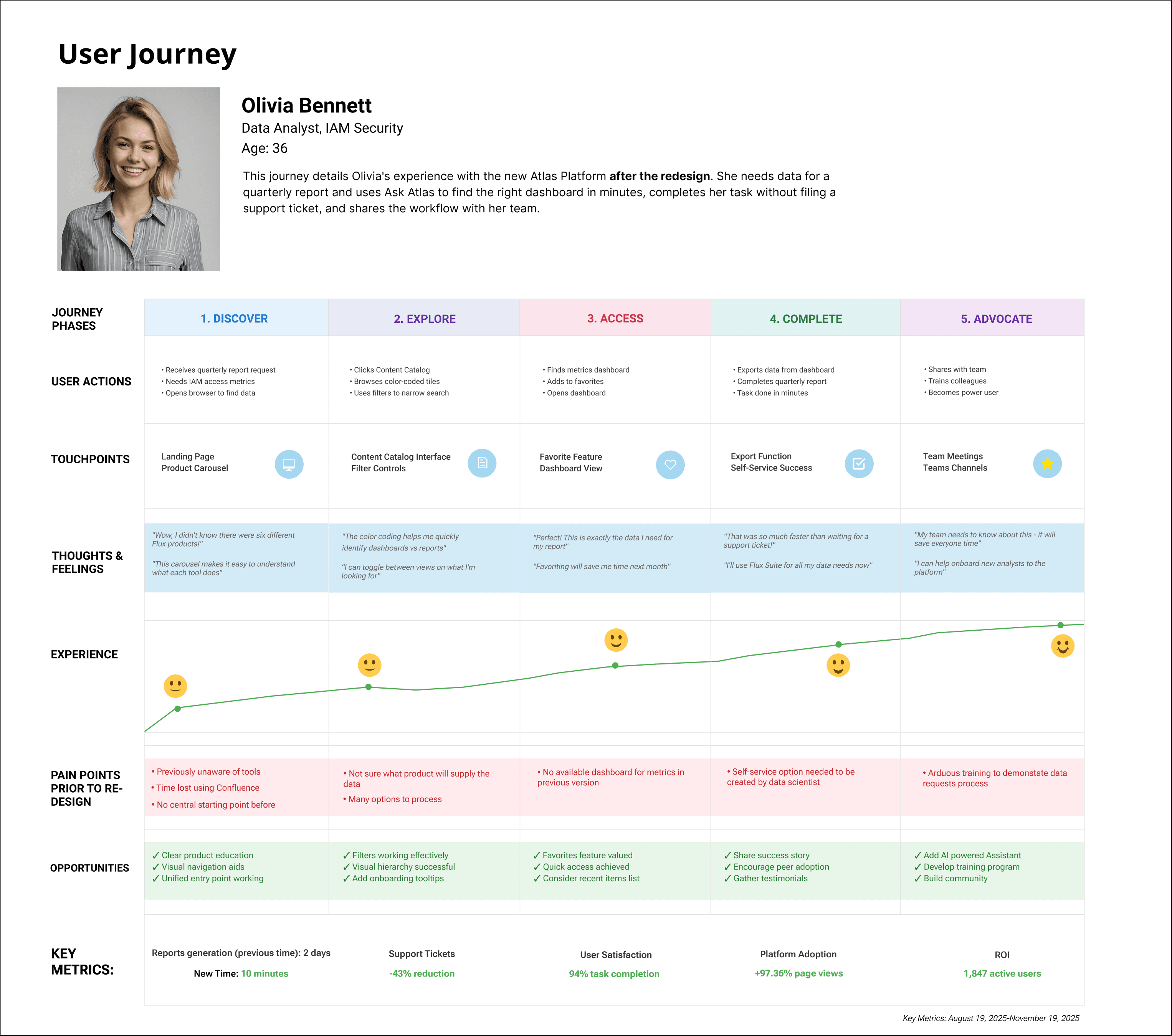
Olivia's journey showed exactly where the experience broke down — fragmented starting points, scattered documentation, and a 24-48 hour wait for help desk support.
Design Goals
Three goals, one north star
The Solution
Choosing clarity over complexity
I explored two directions: a chart-rich dashboard and a minimalist interface. I chose simplicity. Financial data needs precision and quick scanning, and analyst trust was already fragile — the clean layout would rebuild it.
A simple interface, easy to navigate
Clear product names, no confusing datasets
Dual view modes, lists and tiles
Favorites feature for findability
Color coded content types
Robust search options with AI integration
From sketch to system
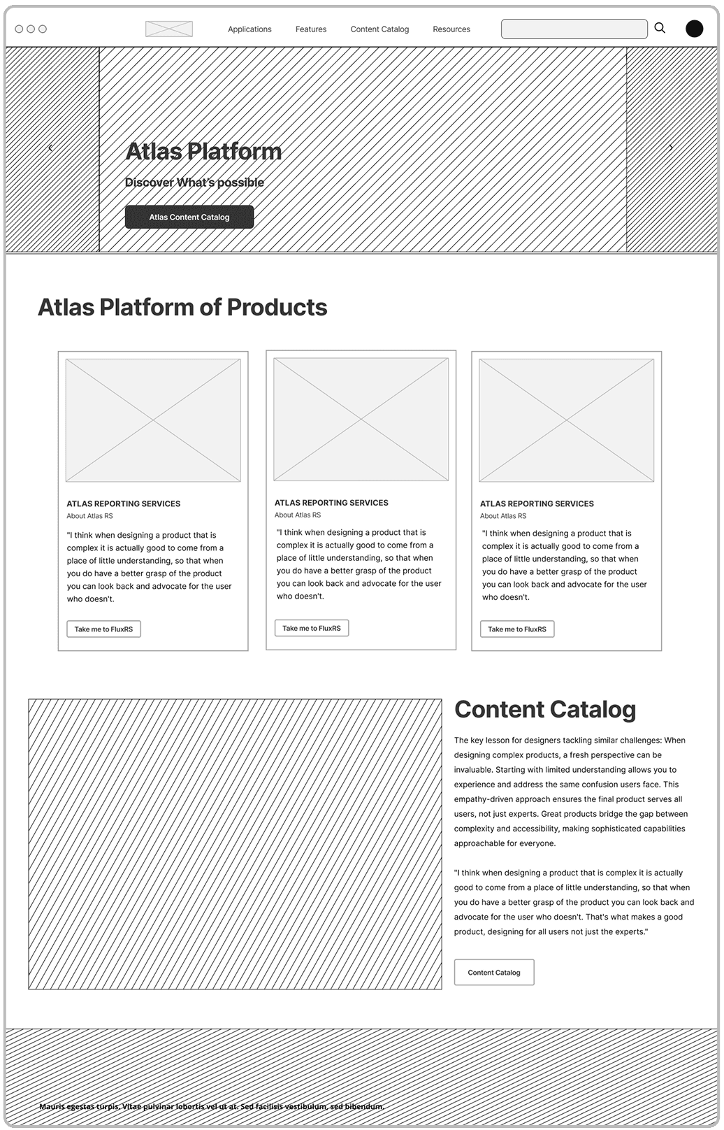
Low-fi wireframes helped align stakeholders early on structure and hierarchy before any visual polish — a chance to validate the information model while it was still easy to change.
Anatomy of a Catalog Card
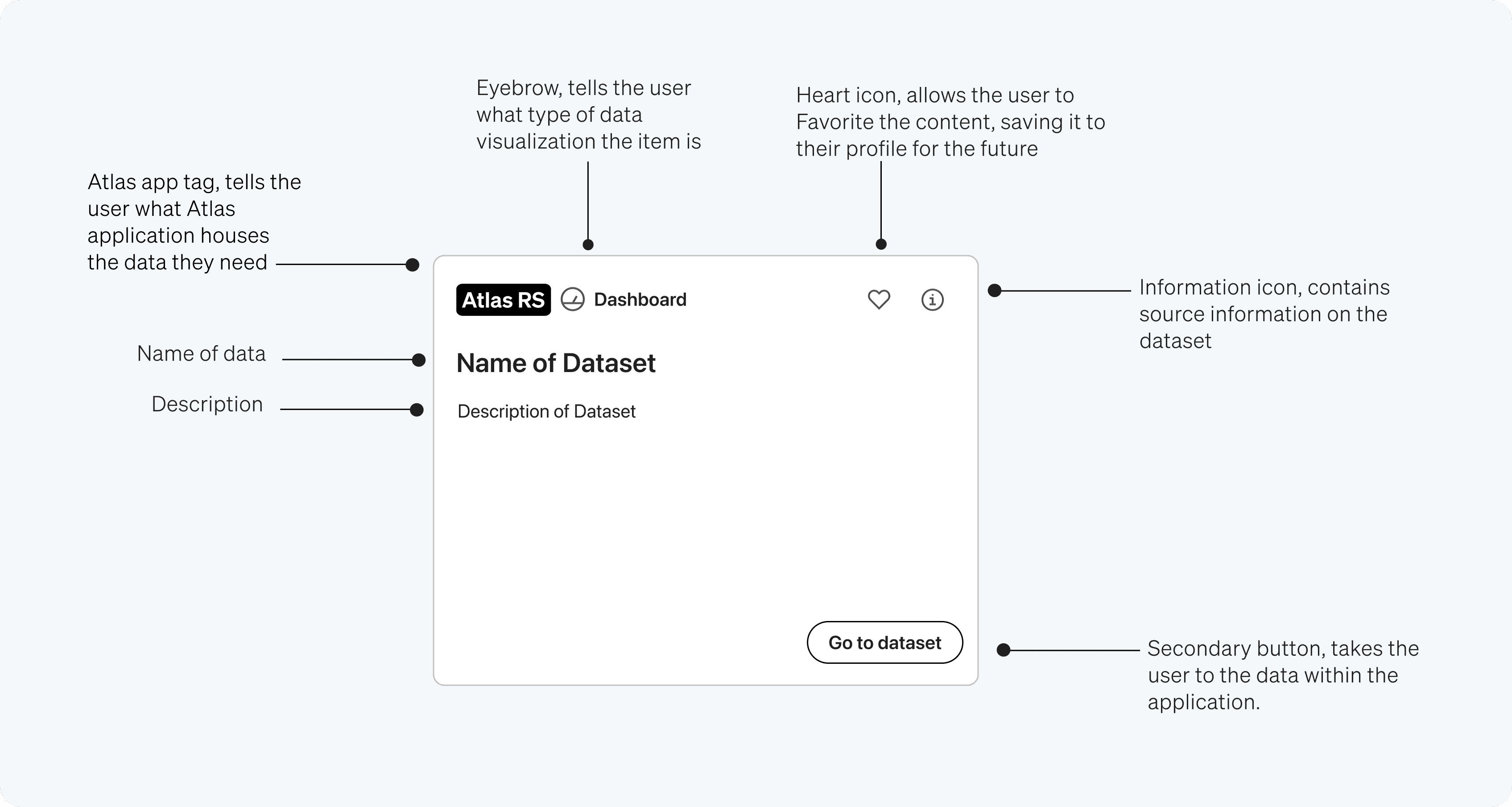
Every element of the Catalog Card earns its place. The source application tag, visualization type, dataset name, and quick actions work together to surface the most important signals first — no decorative details, no buried information. Before the redesign, users struggled to identify the right dataset from a wall of near-identical entries; the new layout solved that by making each card scannable at a glance.
Built accessible from the start
I specified WCAG 2.1 AA compliance through greenline documentation — landmarks, heading hierarchy, tab order, and alt text for every image. Accessibility wasn't an afterthought; it was built into the design system from day one.
Atlas Platform
The Atlas Platform, unified
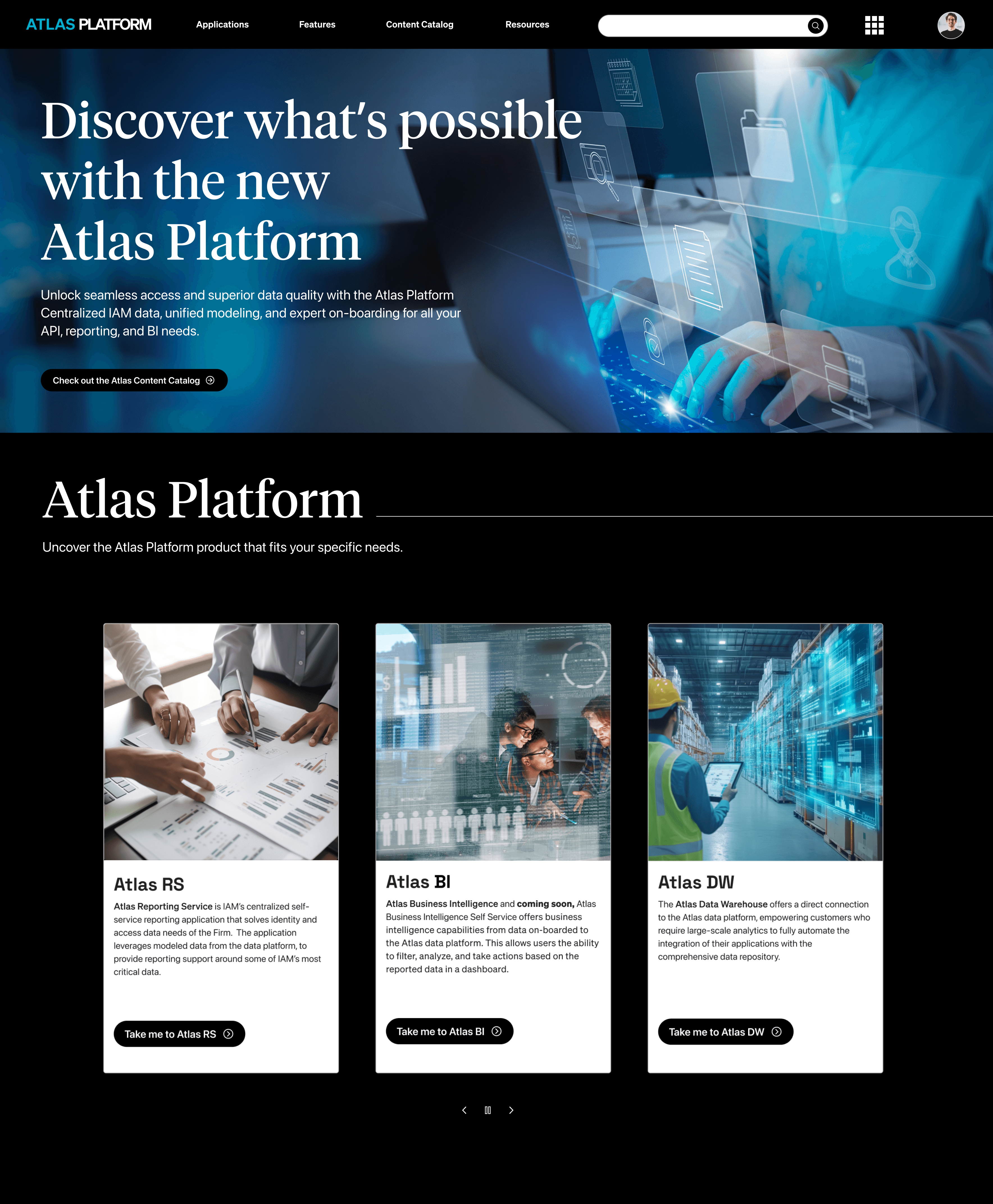
Atlas Platform
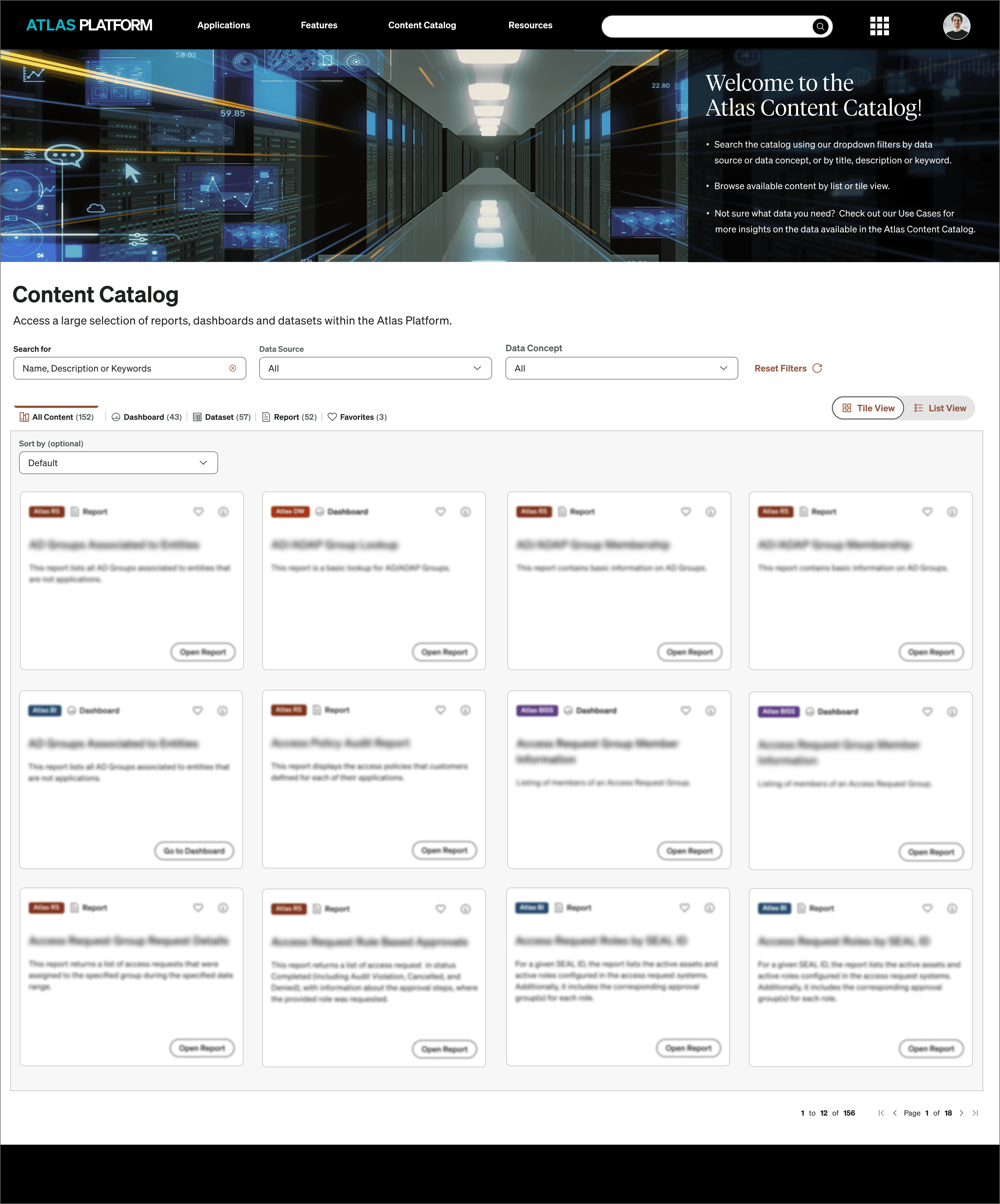
Atlas Content Catalog
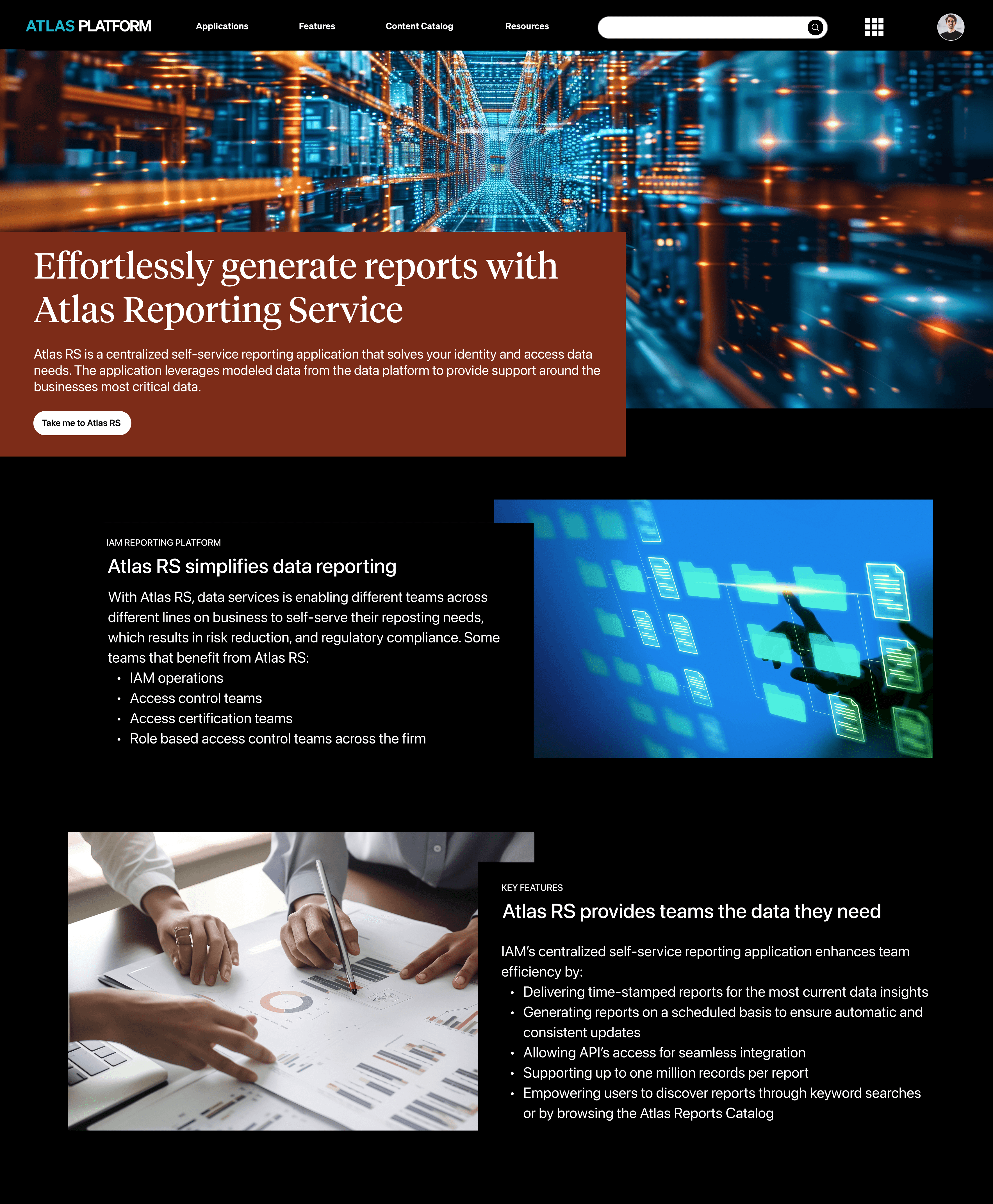
Atlas RS
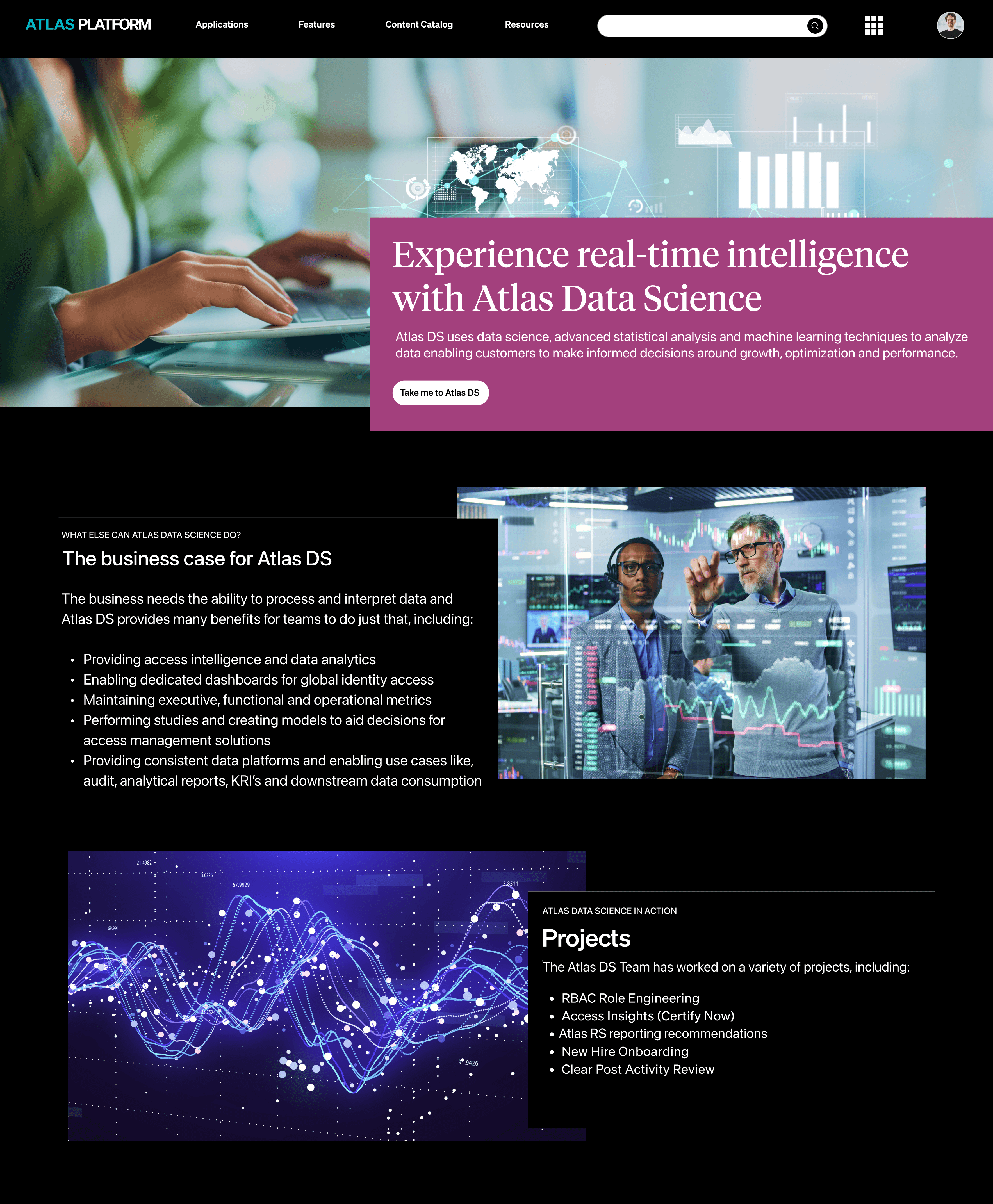
Atlas DS
Business Impact
Proof in the numbers
By unifying six fragmented products into one intuitive ecosystem, the Atlas Platform redesign eliminated friction, reduced the operational burden on support teams, and empowered analysts to find and access critical data independently.
First click success-rates improved significantly across all user tasks
Time-to-find-content reduced from hours to under one minute
Users completed core tasks independently without help desk support.
The new experience
After the redesign, Atlas became a unified experience. Users could identify data in seconds, complete tasks independently, and stop submitting support tickets for everyday needs.
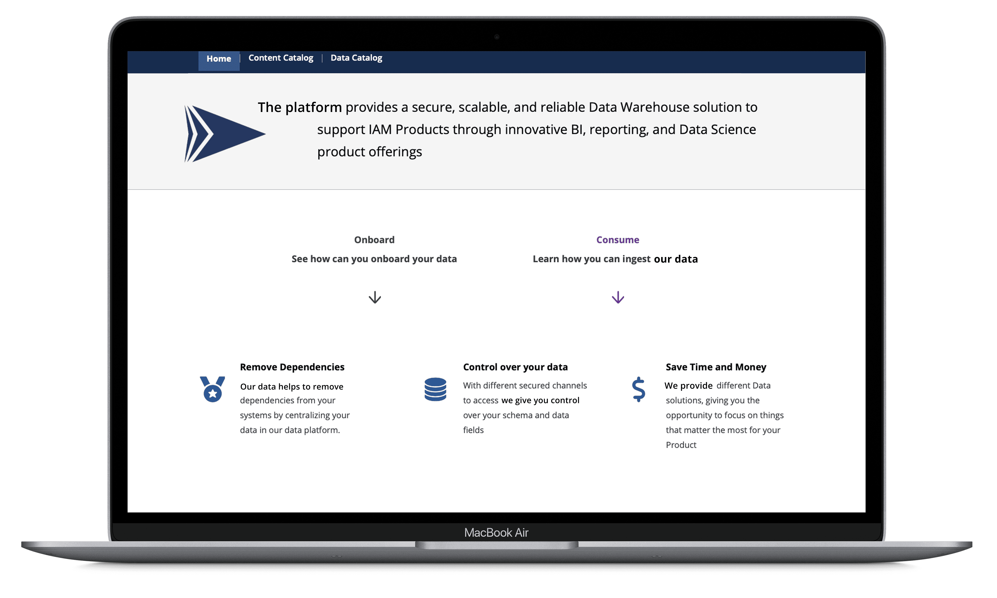
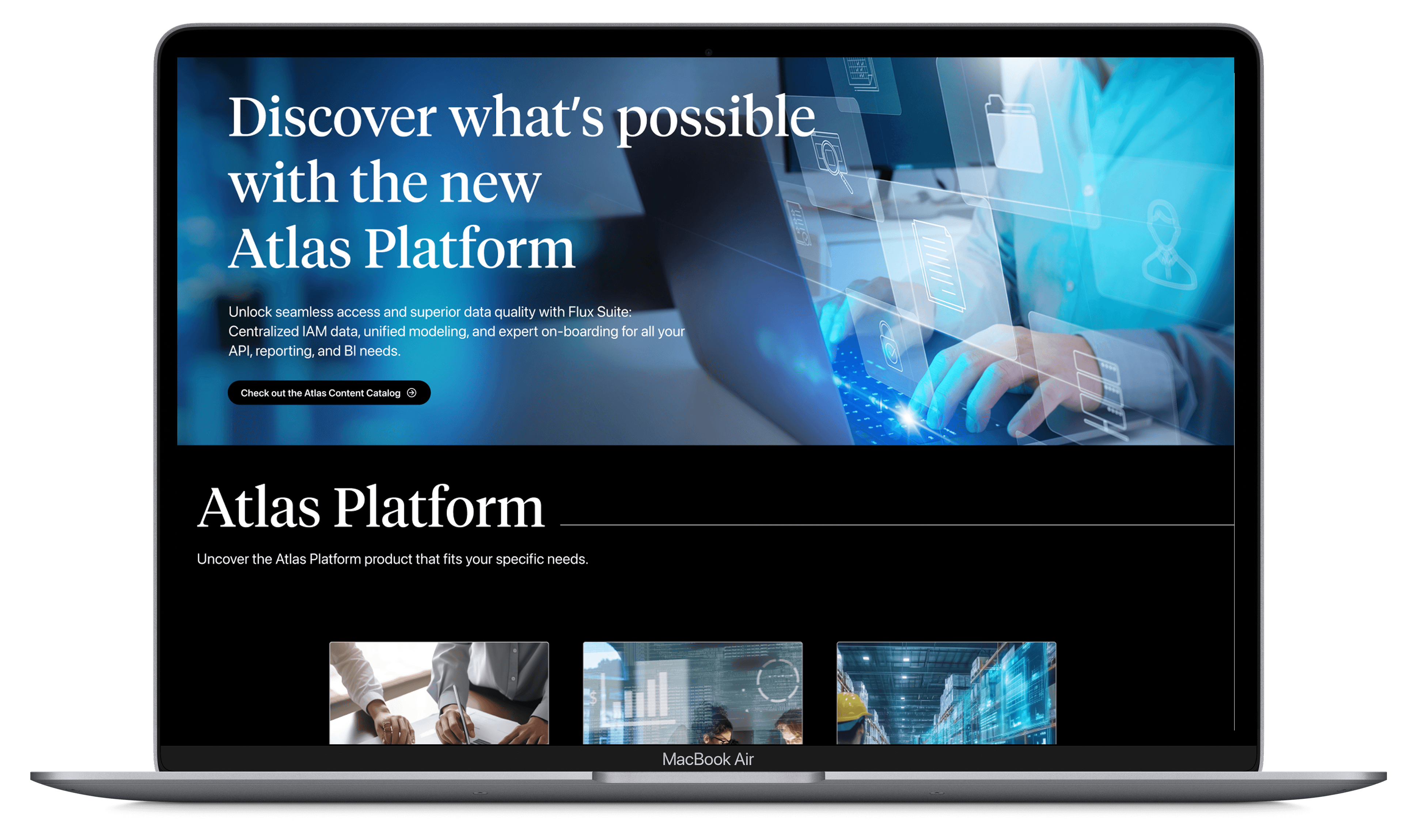
A new first impression
The homepage transformation captured what the entire redesign delivered: from fragmented, text-heavy, and unclear — to focused, scannable, and confident.
Before
After
Reflection
What I learned
This project was the fullest expression of my UX practice to date — research, systems thinking, information architecture, and visual design at enterprise scale. The most important lesson: translating complexity into clarity is the highest-value thing a designer can do. When users can finally see and understand a system that once felt opaque, the impact compounds in ways that are hard to predict — and deeply satisfying to witness.
What's next
Phase 1 solved navigation. Phase 2 goes deeper. Ask Atlas — a generative AI assistant designed to live inside the Atlas Platform homepage — is now available as a working prototype at askatlas.vercel.app, meeting users in plain language rather than requiring them to learn product taxonomy first. The longer-term vision: agentic AI that doesn't just advise, but acts.
Atlas is based on enterprise design work I've led at scale. Names and details have been changed for confidentiality. The strategic framing, design decisions, prototype, and writing are my own.